13 KiB
Introduction
This article is made of two main sections: generic design principles, and Jolly's design principles.
The generic design principles were applied during the development of Liquid Prompt. They should remain valid for its default theme as well as for the Jolly theme. However, the folowing section only discuss their implementation within the Jolly theme.
The Jolly's design principles are more or less specific to the Jolly theme.
What is a Prompt?
There are two kind of computer scientists: those who use the command line, and those who are retired. Even developers who embrace highly integrated development interfaces have some kind of terminal available in some panel of their IDE. Like it or not, the shell is a core part of everyday life for most of the people expecting their computer to work for them.
Now the shell actually has access to a lot of information about the computer. And most of this information is about the current state of the work environment, which is of the highest interest to the user. However, by default the shell only shows very little information unless you ask specifically for it. Furthermore, the only location on the screen available for the permanent display of anything is the "prompt".
The prompt is this string of characters displayed right in front of the line where you type your commands.
In the most common default configuration, it displays only three pieces of information:
the user, the hostname, and the path —user@hostname:path $ .
But it can display more! And this is the objective of prompt systems. Those "prompts" (to be short) actually add a lot of information to this area of the command line. For example, the most common feature is to display the state of the Git repository the user is in.
Prompt Features
This document will refer to feature sets, as a way to group the information in broad categories.
Feature categories are:
- shell essentials: features usually found in a classic prompt (path, user, exit codes…), useful in everyday use (jobs, sensors, multiplexer integration…), or generally considered important (themes…).
- situation: who is connected, and how.
- location: where (which path) the user is.
- sensor: states of the system (temperature, load, spaces, etc.).
- feedback: information from the last command (error, runtime).
- warnings: information conditionning the next command (admin rights).
- version control: Git, Mercurial and co.
- remote: information related to interaction with a remote repository.
- local: information related to the local repository.
- environments: dynamic configuration detection (virtual env, shell variables, containers…).
- toolsets versions: current version of specific tools (programming languages, build chains, tools…).
- miscellaneous shell features: shell-related features considered less important (network, terminal title, hyperlinks…).
- services: services running permanently, online or on the machine (music, weather…).
Theses categories are delineated with the main use of the terminal in mind:
- Features in the shell essentials category is what you will need the most often, whatever you are doing in your terminal.
- If you are a programmer, you will pay additional attention to the version control and environments categories.
- If you are a devops, the dev context category is also of interest to you.
- If you do sysadmin, the miscellaneous category may contain some mildly interesting features.
- If you need features in the services category, you probably misunderstood what a command line interface is, or you are looking for a status bar (which a prompt system can be).
Generic Design Principles
The rationale of a prompt system is that it is actually useful to have an immediate access to the current state of the system. Seeing a state change right where the user actually looks is a very good feedback on their actions. But of course this feedback should not come in the way of how the user works.
States should be chosen and displayed according to their importance for the user's work.
More precisely, a good prompt is a prompt which is:
- accentuated: it makes more visible the feedback for more important state changes, while not polluting the visibility of stable/anecdotal states,
- focused: it targets states that are actually useful to the user during a work session,
- seamless: it does not product friction with the user workflow,
- scoped: it targets states that can change by themselves or be changed by the user,
- measured: it embraces the fact that some states change less often than others (and thus avoids being just a collection of states that only rarely change),
- configurable: be easy to immediately adapt the display of information, if needed.
Accentuated
The prompt should be organized in several sections, which importance should be obvious to the user, depending on their location on the screen and/or their styling.
Section styling should not overflow on neighbor sections. For instance, given that the terminal is organized as a grid of characters, the background of two close (horizontally or vertically) characters will blend. Therefore, one should maintain a certain degree of contrast between sections that are touching each other but have a different semantics.
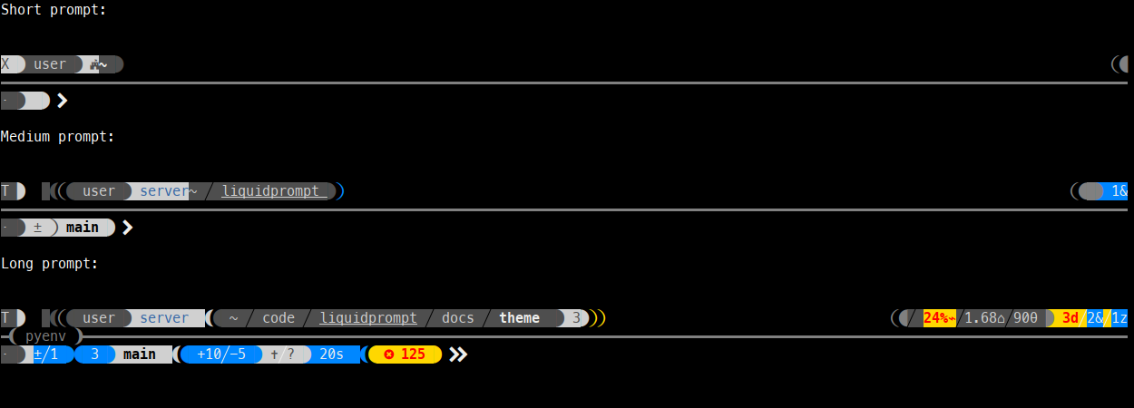
Jolly is organized in four sections, spread on three lines:
- The leftmost part of the first line is the first in reading order. It is thus used for stable and important information.
- The third line is holding the actual prompt, where the user types. It is thus of high importance, and used for the version control, feedback and warning sections.
- The rightmost part of the first line is last in the reading order. It is thus used to display transient states.
- The second line cannot be of background-colored, or it would overflow on the first and last line. It is thus of low importance and holds the environments and toolset versions sections.
Focused
Information that changes often and/or that is important regarding the user's main tasks should be easier to see.
In a regular prompt, most of the text has no background color by default. Any text which has a background color is thus easier to spot.
Therefore, important information should be displayed in a background-colored segment, while less important information can be displayed in a foreground-colored one.
Information related to the situation and location of the user should always be considered important, as they may drastically alter the workflow of the user.
In Jolly, the toolsets versions and environment feature sets are to be displayed in a foreground-colored section of the prompt, while the others are in background-colored sections.
Scoped
States that are measured and not directly changed by the user should be hidden by default. Counters that can fall down to zero should be hidden by default.
In Jolly, sensors are hidden by default, while situation and location information are always shown, even if set to the default state. However, the default states are represented in the smallest possible way, like a single icon.
Measured
States that are expected to change often during a work sessions should be considered important. States that rarely change or evolve slowly are less important.
In Jolly, sensors are grouped on the righmost part of the first line of the prompt. Information about version control is however close to the actual prompt.
Configurable
Each aspect of theming should have a related configuration variable.
More details
If you want to know more, check our opinionated prompt systems comparison that goes into more details and give examples across various other prompt systems.
Jolly's Design Principles
Stability
Essential information should ideally be located at the same location on screen, whatever the displayed states. New information being shown after a predictable state change should not change too much the location of information previously displayed.
Using four sections allows Jolly to drastically improve the stability of the prompt, as opposed to a prompt on a single line. The less stable section is the VCS one, which often changes after each command when the user is working on their repository. Sections are thus organized from left to right, in decreasing order of stability. Jolly always displays important segments, even in their default state, so that they are always located where the user expect them to be.
![]()
Sectioning
The prompts having issued the previous commands should be easy to find while the user is scrolling up the terminal.
Jolly uses both background-colored sections that are always displayed and a line traversing the whole terminal to separate all command outputs in sections. The graphical design of the prompt itself is quite rare in classical commands outputs, making it easy to spot. Finding the command that issued the output is as easy as finding the horizontal line.
Proximity
The more important and/or the more frequently updated information should be displayed the closer to where the user is looking: the prompt cursor. Related information should be displayed close to each other, especially if there is some semantic meaning linking them.
If the information is to be displayed far away, a small segment may be used to recall the user that they should look elswhere.
In Jolly, the path (one of the —if not the— most important information) usually appears on top of the prompt's cursor location. Admin privileges is shown on the prompt's mark, right next to the prompt's cursor. VCS information is also next to the input area.
The location at the end of the path can display some right-pointing arrows, recalling the user to look at the sensors section, if there are many information displayed there.
Segments
To implement the accentuated principle, Jolly uses background-colored segments of information. To ease the visual browsing of those segments, it uses the visual separators introduced by the Powerline project.
While Jolly can theoretically use many of the "powerline" characters as separators, it recommends using the "arrow" one, which fits better the semantic sequence principle.
Semantic Sequences
Segments are ordered in sequences that have a meaning. For instance from the more generic to the more specific, from a natural order of action, or from an architecture hierarchy.
The first line of Jolly display the classical how-who-where sequence. The VCS section displays elements from the more remote to the more local. Spaced reverse arrows in the VCS sections actually show the direction of the expected action (e.g. "to be pushed" = local-to-remote = right-to-left).

Semantic Spaces
Jolly makes use of negative spaces between segments to convey information. This allows for a compact display, and avoid cluttering the screen with icons.
When displaying something with a space, the direction of the segments are reversed, making them more easy to spot, at no cost.
It is possible to insert a separator character within a space, to emphasize its importance.
Spaces are generally used to mean some kind of "disconnected" state.
Jolly spaces comes in three levels: simple space (no inserted character), light space (light arrow inserted in the space) and strong space (heavy, colored arrow). Jolly uses spaces to indicate the type of network connection (there is no "direct" connection), the fact that the user does not have writing rights (they are "disconnected" from the directory), or the fact that a state has diverged between local and remote.
Semantic Accessibile Colors
To avoid colorblindness issues, Jolly relies on as few colors as possible, and tries to maximize the contrast between segments.
The basic display is built of alternating black and white segments, which should be readable on both dark and light terminal backgrounds.
Important information may be displayed using two other colors: one for information that should be noticed, and one for warnings and errors.
Jolly allows the user to select whatever pair of colors fits their colorblindness issues, and comes with several presets. Its default is set to blue/yellow, following the most classical recommendation to bypass the most common colorblindness issues. The basic segments use tones of dark and light greys with AAA contrast between them, appearing as black and white on many classical terminal backgrounds.
![]()
Semantic Thresholds
Qantitative measurements (number of something, sensors, etc.) may be displayed in three states, each of which is associated with a semantic color:
- below lower threshold: black or white,
- between lower and higher threshold: note color (blue, by default),
- above higher threshold: warning color (yellow, by default).
For instance, the number of commits to be pushed, or the number of modified lines in the VCS section are all displayed with this semantics.